Responsive Design Archives -

Time to review your customers’ experience?

Posted on February 16, 2017 by

Time to review your customers' experience
Is it time to review your customers’ experience?

If you are looking to build a better more profitable business, it pays to take some time out to review your customers’ experience – put yourselves in their shoes and see the experience they have. Here’s where to start;

How do your customers find you?

This applies to both existing and new customers. Existing customers behaviour is very much to use the internet to find your email, office address or just find other more specific information – most of the time they will do this without you knowing. New clients will do the same but are likely to be looking for more general information about products or services – they may also search for you by name but possibly also by product or service.

Continue reading →


Why Does Your Site Need To Be Responsive?

Posted on October 2, 2016 by

There are now more mobile devices on Earth than there are people – and as almost 60% of all website traffic comes from these devices, it’s never been more important to make sure your site is designed and developed with mobiles in mind. A responsive design means your site can be used and enjoyed by users on any sized screen or device – which will not only give your users a better experience, but also boost your SEO.

Responsive

Continue reading →


6 Mistakes That Turn Mobile Customers Away

Posted on May 26, 2016 by

Think of the online customer as a spoilt child – and that child doesn’t like waiting. A delay in delivering a mobile friendly website causes them havoc, rushing away as if you have the plague – all this happens because of a few schoolboy errors.

The digital generation has no patience for disappointment in user experience. They want it now, they want it their way. We’ve identified six issues that are particularly annoying for mobile users, and any one of these mistakes could drive visitors away from your site.

6 Mistakes that Turn Mobile Customers Away

  1. Your website simply fails to load

Even the giants of American marketing sometimes fall short in the most basic ways, by making sites that entirely fail to appear on mobile devices. Although visibility into the mobile UX can be challenging ‒ especially when you factor in the sheer number of mobile devices and the slowness and inaccuracy of many mobile testing tools, it’s no excuse for making a site that doesn’t work at all on mobiles.

Doritos recently had a high profile campaign designed to leverage the excitement surrounding the Batman vs. Superman movie – but it didn’t go to plan, as it did not work at all on mobiles. Can anything be sadder than pouring buckets of money into a high-profile campaign, only to have it not appear? All that money created irritation, not excitement.

Tip: Make sure your website displays on all market-leading phones or tablets!

Continue reading →


A Beginner’s Guide To Content Management Systems

Posted on April 27, 2016 by

A content management system is vital for ensuring your website runs smoothly and is easy to maintain – so it’s vital you choose the CMS best suited to your business. There are endless different platforms available, so here we will go through some of the most popular and explain the basics, to help you make the right choice.

Continue reading →


Why we think the iPad sales are going down..

Posted on January 30, 2015 by

iPad-AirWith Apple Inc posting their biggest ever sales quarter recently, it sparked a conversation in the Web-Feet office about tablets and where they fit into the mobile device space. This was as a result of iPads sales growth slowing significantly whilst smartphones sales, iPhone included, continue to rise quite sharply.

Aside from the argument of what a tablet actually does vs a PC or smartphone, we feel that smartphones and phablets, as larger smartphones are sometimes referred to, are increasingly becoming both cheap and capable. However, we feel that it’s also smart, responsive website design that’s also driving these changes in buying behaviour and phone use. A couple of years ago, many website owners were tempted into building mobile only versions of their websites, however with hi-res screens available, most users will switch to view the desktop site because the mobile sites were just too limited and not very engaging.

With a fully responsive design, a good website now optimises itself based on the users device, therefore optimising the user experience. As such the need for a ‘retina’ tablet for browsing the web isn’t necessary and users can stick to their primary device for browsing the web and still have a great user experience.

We feel that cheaper, smarter, faster phones will continue to drive their popularity and further marginalise tablets. If you know you can get a great browsing experience on your phone, your primary device, you are less likely to bother reaching for your tablet.

What this means for businesses however is twofold. Firstly, a good responsive website is a must or your users will have a poor experience and you will not be able to leverage your online presence to your best advantage, put bluntly, your users will just not visit your website. Secondly, Google now lists sites that are mobile friendly in their search pages on mobile devices and shows them as such in the search listings. This is useful information to users as they may well avoid even looking at a site that is not shown as mobile friendly. Furthermore, Google will actually penalise your site in it’s search engine rankings, or put another way, will list mobile friendly websites above those that aren’t. Eventually, non mobile friendly, non responsive sites will fall right down the search listing when carried out on a mobile device, this is a significant point bearing in mind how much traffic is now from mobile devices.


Lens Flare New Years Home Page

Posted on January 14, 2015 by

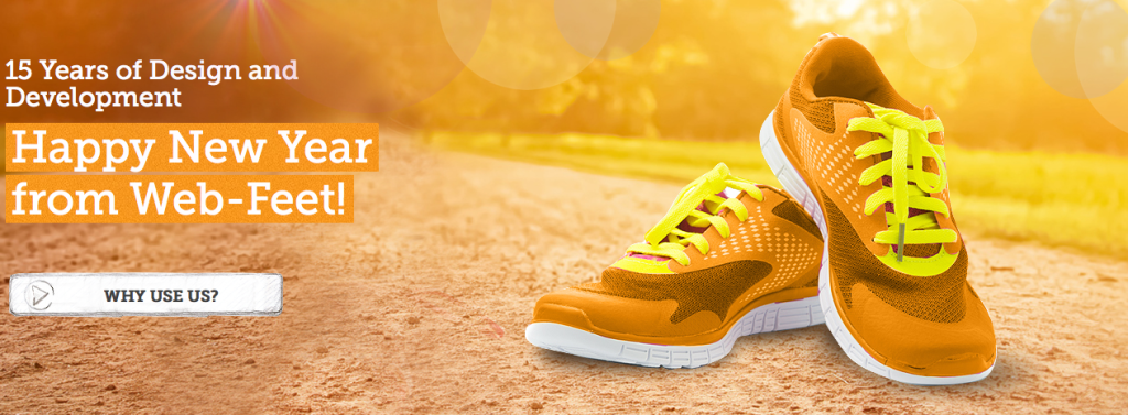
beautiful home page banner

In a concinuation of our varied home pages we came up with the concept of a New Year’s banner that reflected the practice of people getting fit as their New Year’s resolution, Jakub, our designer came up with the concept image above and we all thought it was great so we got the banner ready to go.

In keeping with all of our other home page banners we wanted some kind of interesting movement. After a bit of searching I found a link to this tutorial – https://www.script-tutorials.com/flare-lens/ which enabled me to put a nice lens flare effect on page load.


Applewood Joinery New Website Live!

Posted on June 16, 2014 by

The new site for Applewood Joinery is now live!

Applewood Joinery manufacture a range of high quality joinery products. They specialise in staircases, windows and conservatories and will also create bespoke joinery for other applications. Check out their website if you’re interested.

Their site is built on the new Web Feet CMS making content management simple and easy. The design is now responsive so it will scale up and down for mobile and desktop platforms respectively. Also added is a ‘case studies’ section; allowing them to update their site with recent work they have done. Multiple galleries have also been added with an ‘enlarge’ function making it easy to display their latest work. A simple contact form has also been added, allowing potential customers to get in touch.

Please tell us if you like the new Applewood Joinery site, and get in contact if you require something similar.


Apple Office New Website Live!

Posted on May 12, 2014 by

The new site for Apple Office Equipment Ltd. is now live!

Apple Office specialise in new and refurbished risograph digital printers and professional colour copiers for office usage. Offering a range of printer/copiers from Riso, Olivetti, Panasonic and Bizhub, Apple Office have the supplies to suit you needs! Check out their website if you’re interested.

The site now features the new Web Feet content management system to streamline page changes and updates. Fluid transitions between desktop and mobile devices are now apparent thanks to our responsive design template, making it easier to view from your phone or tablet.

We think the new design refresh looks great, and we hope you feel the same. Please contact us if you require something similar.


Willow Madison Kitchens Responsive Site Live!

Posted on December 20, 2013 by

The new site for Willow Madison Kitchens is now live!

Willow Madison Kitchens specialise in bespoke kitchens made in their Chandlers Ford workshop. They create a range of custom fitted kitchens and hand-crafted furniture using traditional methods. Check out their website if you’re interested.

The updated design features include the new Web Feet content management system allowing for simple management of pages and page content. Also the responsive design with image galleries and custom internal page colours allows for better viewing on mobile devices. The site also features a WordPress blog system so they can give frequent updates for new events.

We love the sharp new design – and we hope you do too. Please contact us if you require something similar, and we’d be happy to help.



Adapt Landscapes Site Now Live!

Posted on October 25, 2013 by

The all new website for Adapt Landscapes is now live!

Adapt Landscapes specialise in landscaping design and construction offering; garden design, paving, driveways, fencing, decking, planting and turfing services located in Hampshire. Take a look at their new site for further information.

It features a new simple responsive design layout making it clear to view the content on a mobile platform. Also added to the site is new easy to use contact forms and image galleries making the site experience smooth. The site is using the new Web Feet content management system allowing for effortless updating.

We hope you like the new design, please get in contact if you need something similar.


Some of our happy customers

logo ahmad
logo poingdestres
logog swiss
logo ibhs 1
ww
logo sgc
logo nationwide
logo undersea
logo roughton
logo stcross
logo pulse
logo mm
logo jfl
logo heritage 1
logo firesafe
logo electrofreeze
logo clickmetal
logo baguetti
bpc
logo ccc 1
log arokah
logo labs
logo paragon
logo trant
logo nahh
logo edge
logo romsey
ace1
ace2
spaceway logo
logo bookharbour
logo chartco
logo cranbourne
logo magister
logo mgmetals
logo westway
logo ocean
logo testvalley
logo brittania
logo faac
recref
logo gss